
Chase Payment Selection for Web
Designing a scalable payment selection platform
I owned product design end to end, creating a reusable payment selection experience that balanced consistency across Chase's web banking ecosystem with the needs of different payment journeys.
Role Product Design Lead, E2E
Team 1PM, 1UX Researcher, 7 Engineers
Timeline 6 months
Status Shipped
THE CHALLENGE
Creating a consistent experience without sacrificing flexibility
Chase's web banking products handled payment selection differently, creating inconsistent customer experiences and duplicated design and engineering effort.
Upcoming technology migrations created an opportunity to build a reusable payment selection platform and improve consistency for customers while making it easier for product teams to integrate.
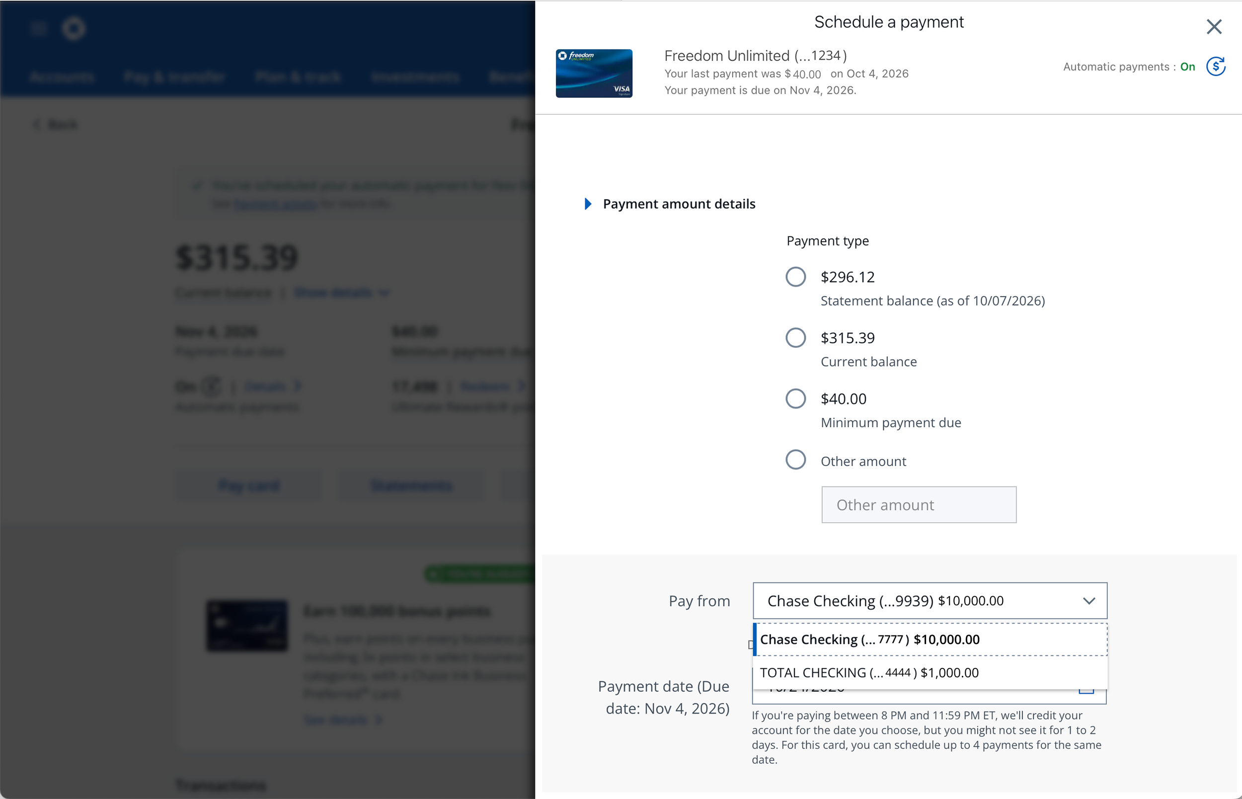
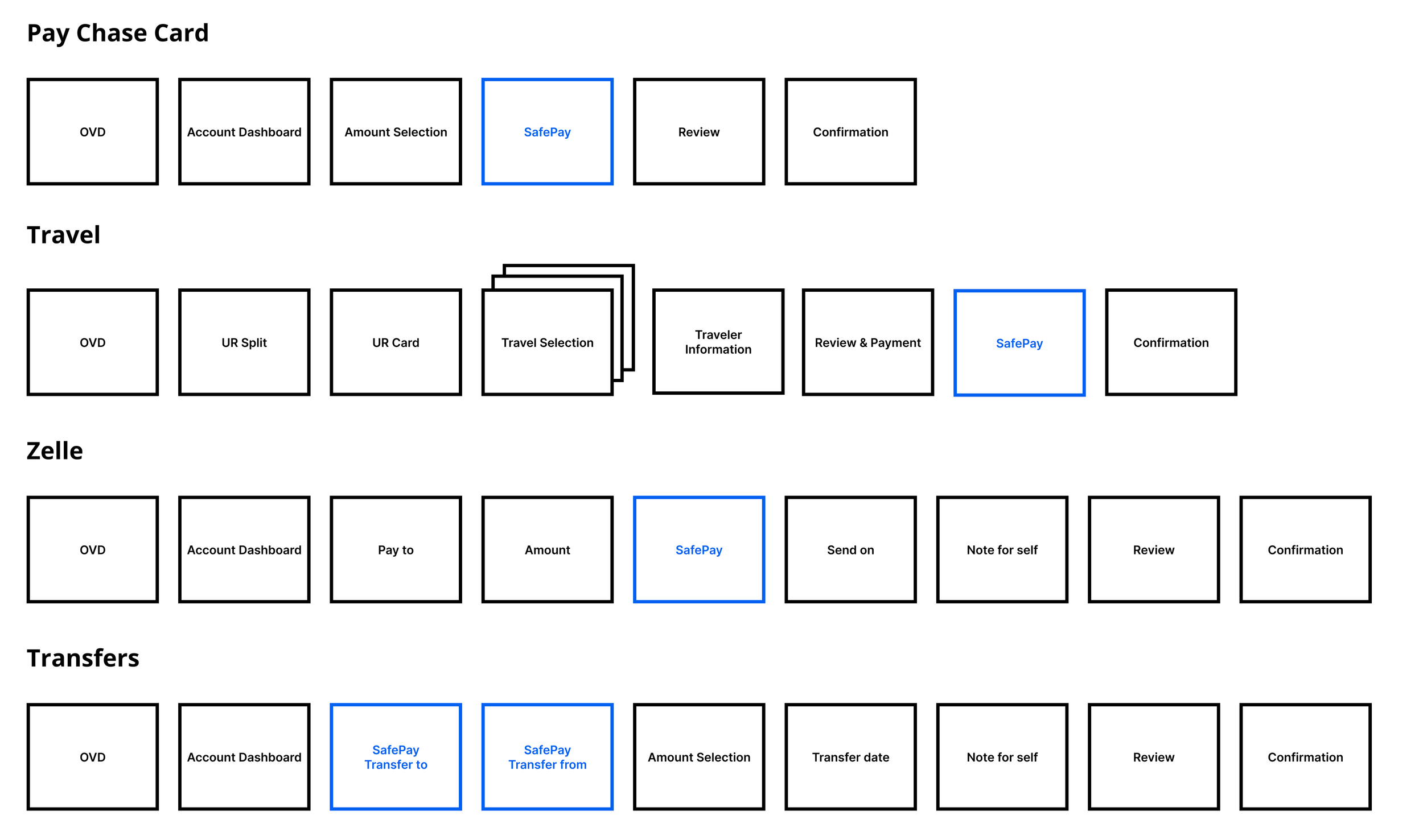
Zelle
Pay Chase Card
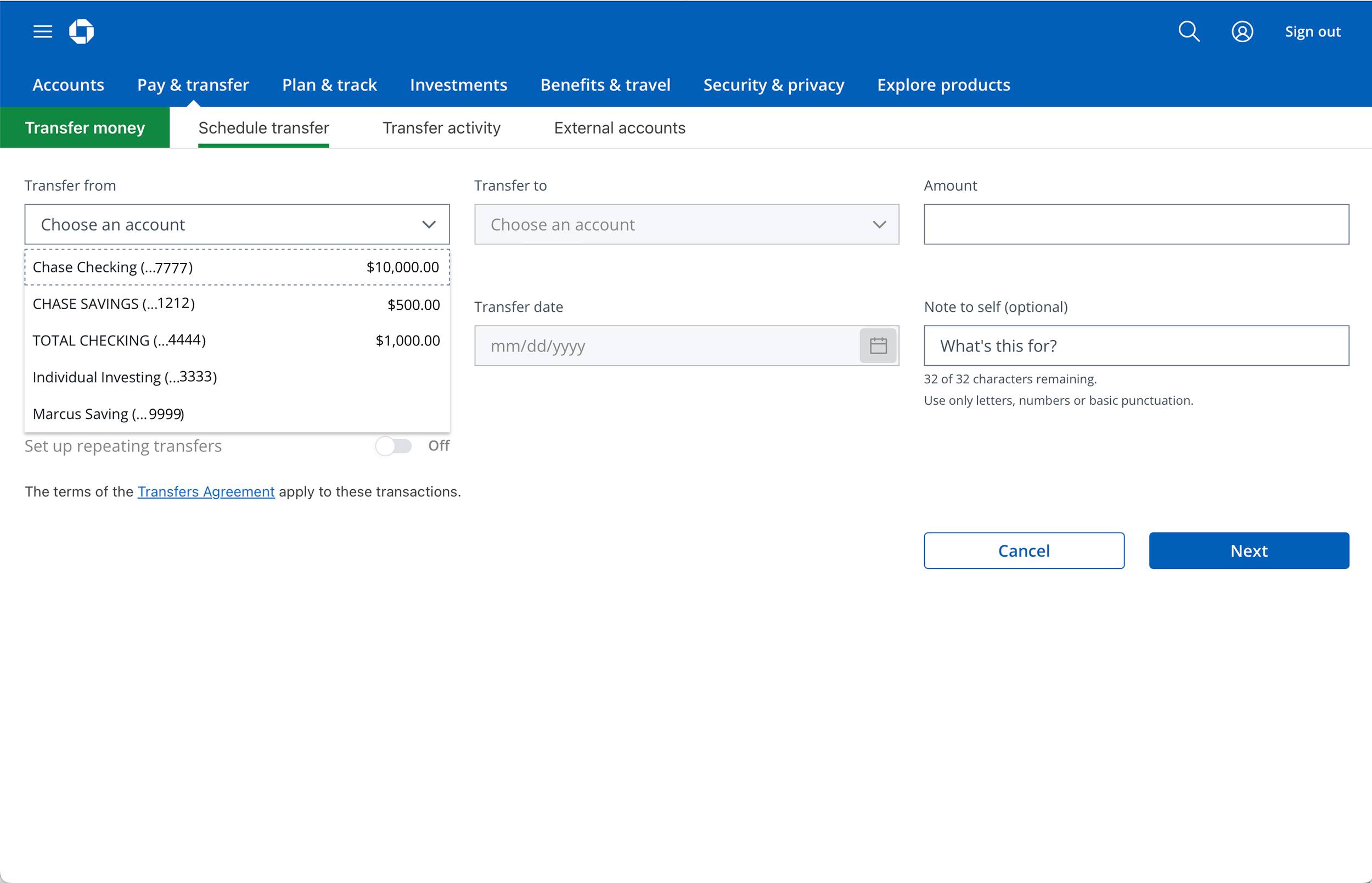
Transfers
KEY FINDING
No single interaction pattern worked equally well for every journey
Straightforward payments benefited from familiar, efficient selection, while more complex journeys required greater visibility and flexibility.
DEFINING THE STRATEGY
A tiered approach to platform adoption
Discovery revealed a key tension: Chase needed a shared payment platform, but each product had different customer needs, technical constraints, and modernization timelines.
I defined a tiered adoption strategy that let teams integrate SafePay incrementally, without forcing every journey into the same experience.

01 — Backend service
Modernize the underlying architecture while preserving existing customer flows.

02 — SafePay Light
Adopt the updated payment-selection experience while maintaining familiar journeys and core payment methods.

03 — Scalable SafePay
Support more complex payment-selection needs and expanded capabilities, including split tender.
EXPLORING DESIGN
Evaluating the trade-offs between simplicity and flexibility
I explored three interaction patterns to understand how each balanced familiarity, account visibility, and flexibility across payment journeys.
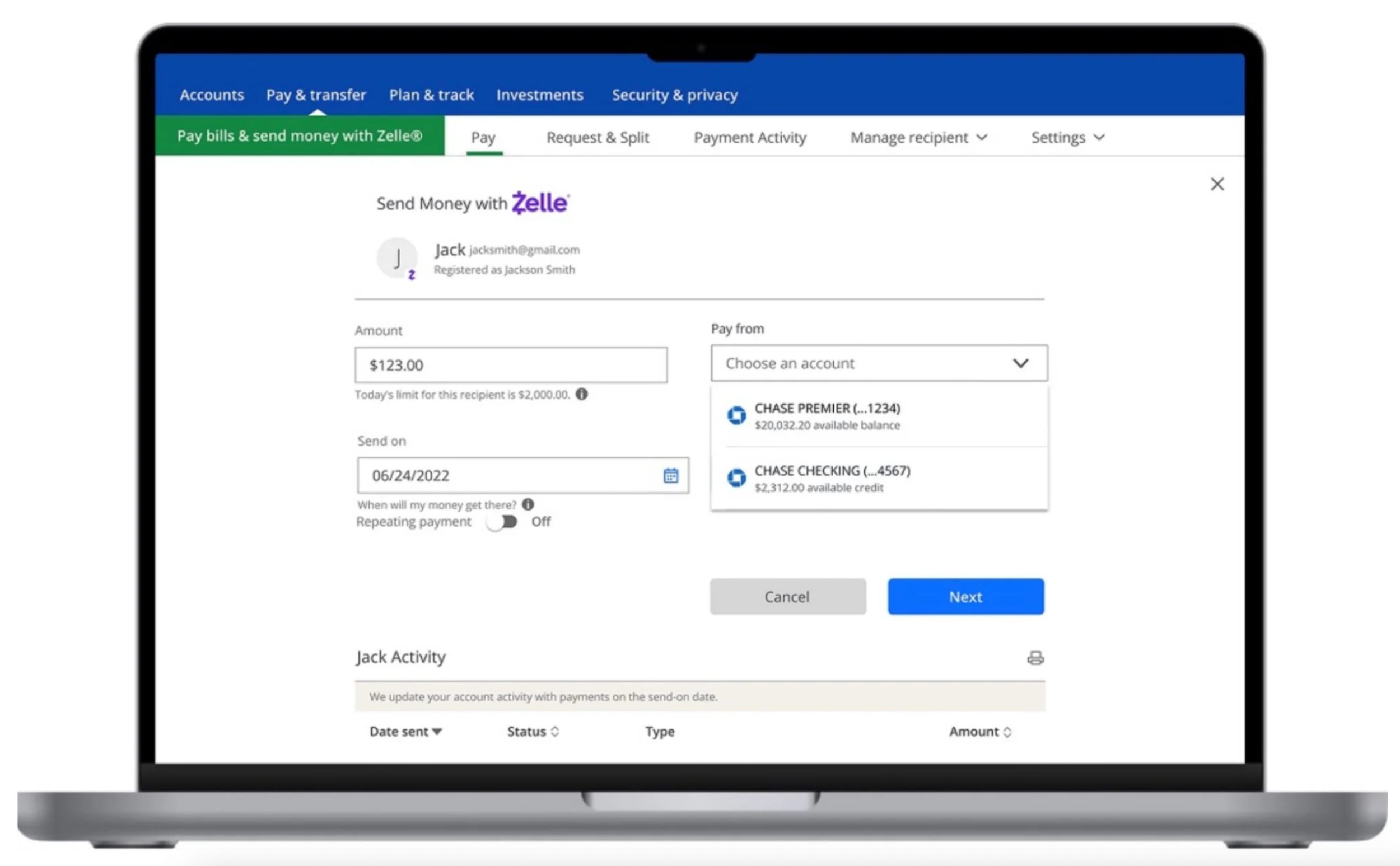
Dropdown — preserve familiar flows
Kept account selection alongside the payment amount, minimizing disruption to established journeys.
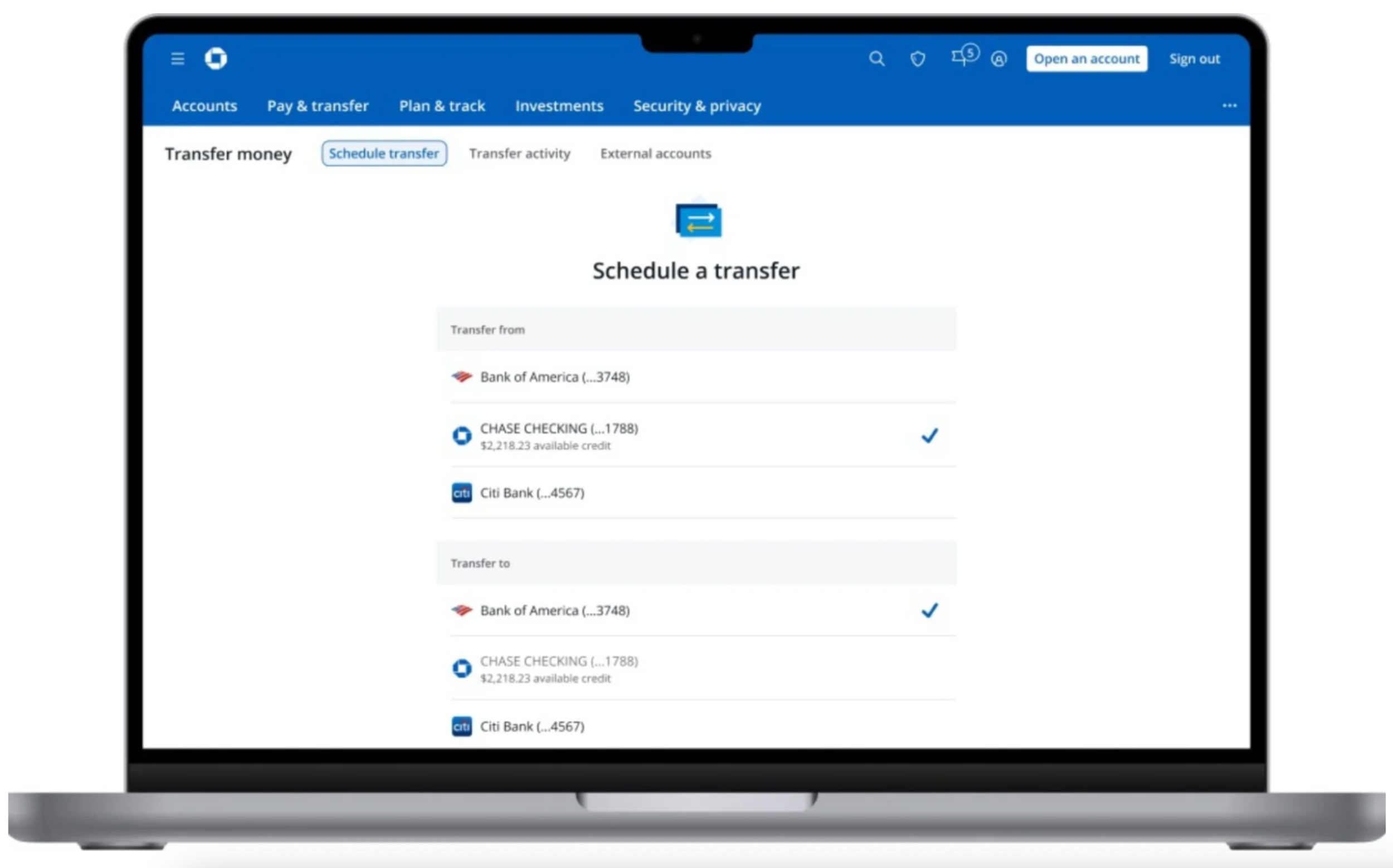
List — increase visibility
Made available accounts easier to compare, supporting more complex payment decisions.
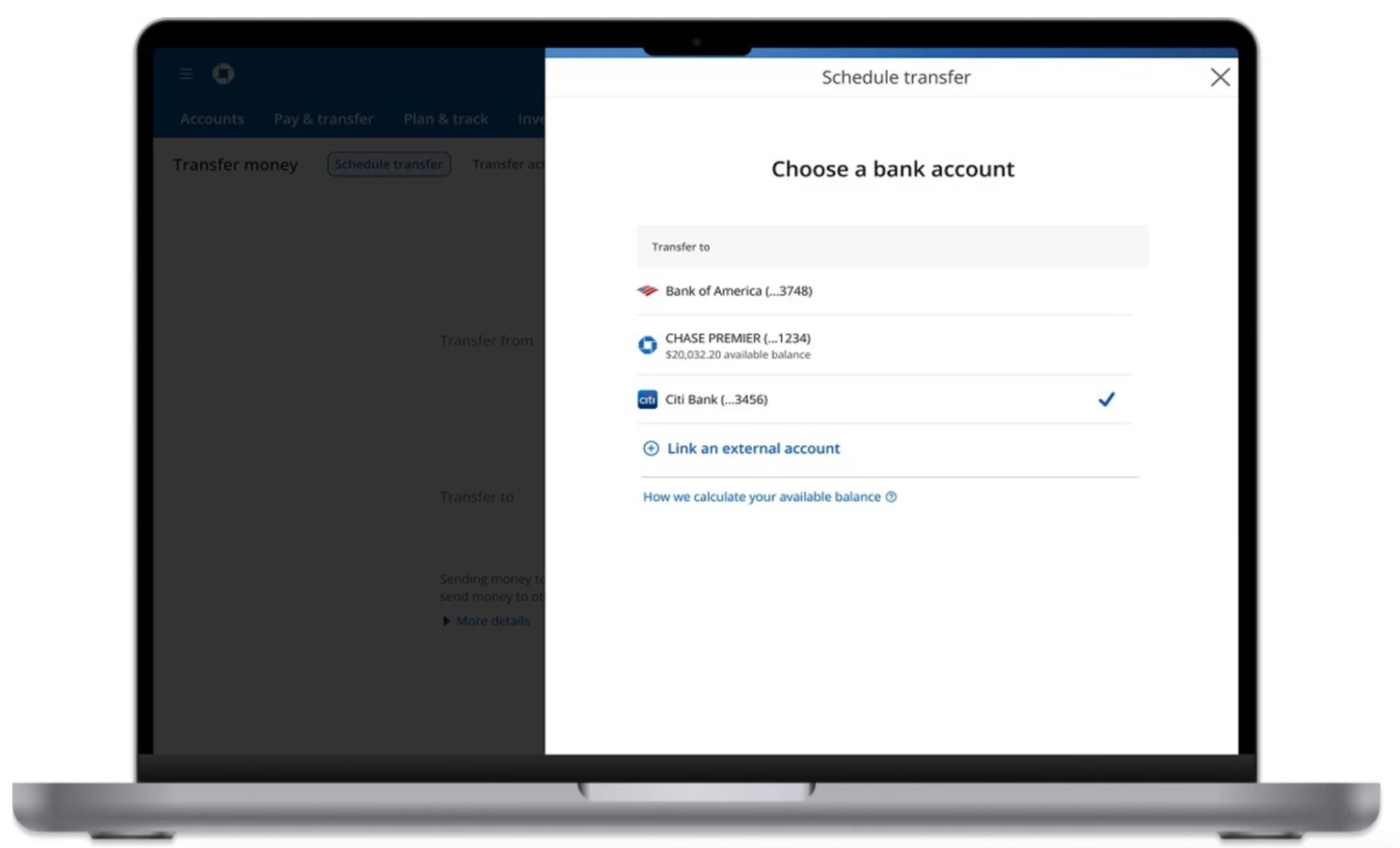
Preselection + slide-in panel — simplify the primary flow
Kept the main journey focused while allowing customers to change accounts in a separate panel.
I brought these concepts into customer research to understand which trade-offs best supported real payment decisions.
CUSTOMER RESEARCH
Testing the experience across different payment journeys
I partnered with a UX researcher to test three payment selection patterns with 10 Chase customers across Zelle, Transfers, and Pay Chase Card.
Three insights that shaped the direction:
01
Journey complexity matters
Straightforward payments benefit from familiar, streamlined selection. Complex journeys need greater visibility and flexibility.
02
Account information builds confidence
Logos, available balances, and clear selection indicators helped customers distinguish between accounts and make informed choices.
03
More interaction isn’t
always clearer
Showing every option can overwhelm customers. A separate selection panel can add unnecessary steps.
The key takeaway
The right interaction pattern depended on the payment journey—not a one-size-fits-all standard.
THE SOLUTION
A flexible selection system built around customer needs
I translated the research into two reusable interaction patterns, giving product teams a consistent foundation without forcing every payment journey into the same experience.
Dropdown
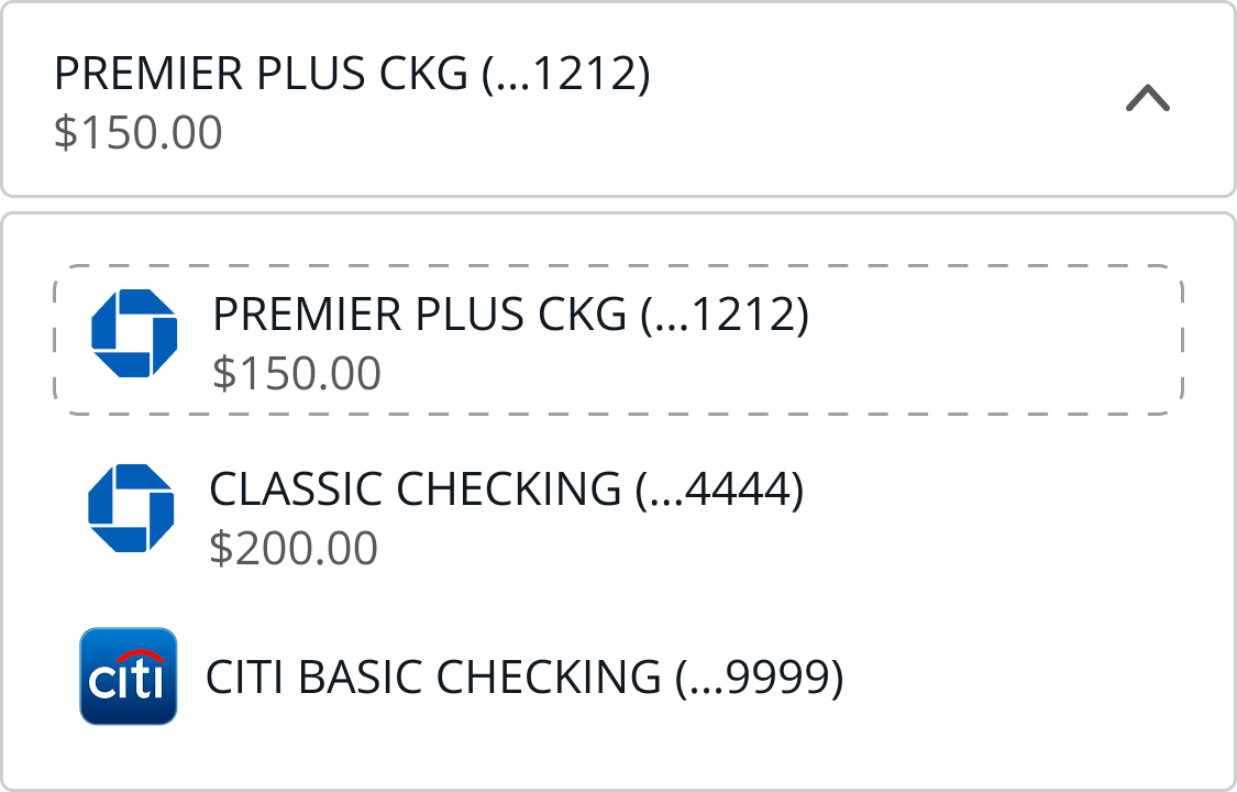
Designed for straightforward payment journeys. Kept account selection alongside the payment amount, preserving familiar flows and minimizing disruption.
List
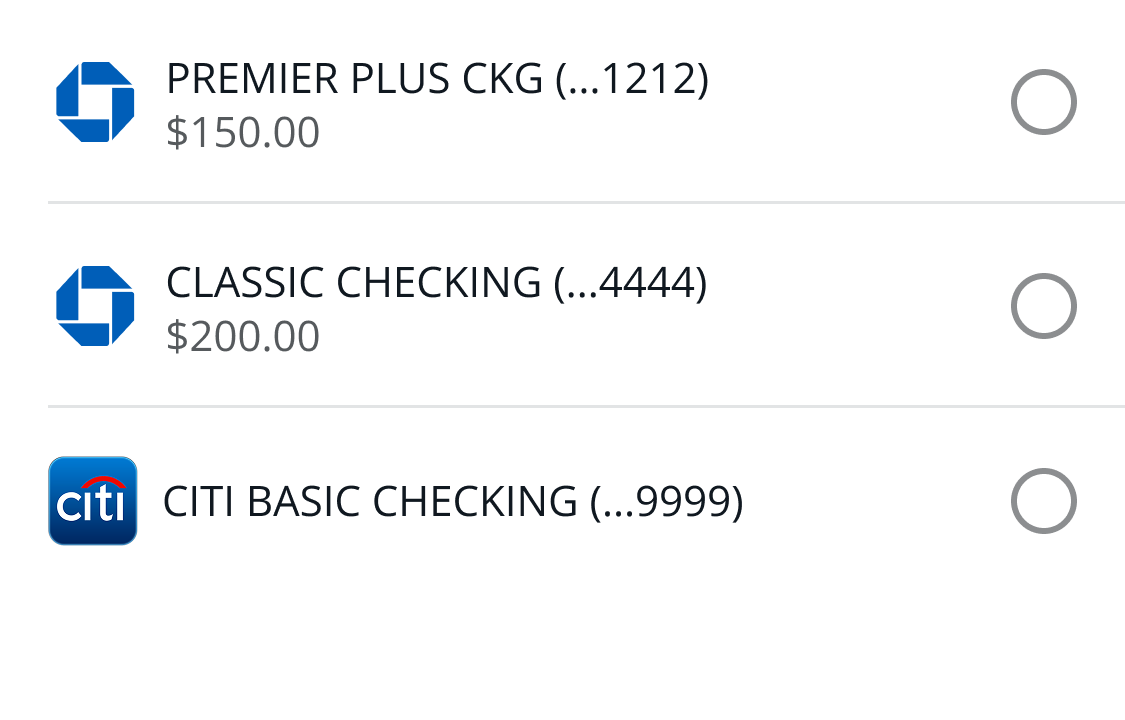
Designed for more complex payment journeys. Made account options easier to scan and compare, supporting more informed selection.
One platform, flexible by design
Both patterns followed shared principles: keep decisions in context, make account choices clear, and support evolving payment needs.
DELIVERY & IMPLEMENTATION
From design direction to implementation
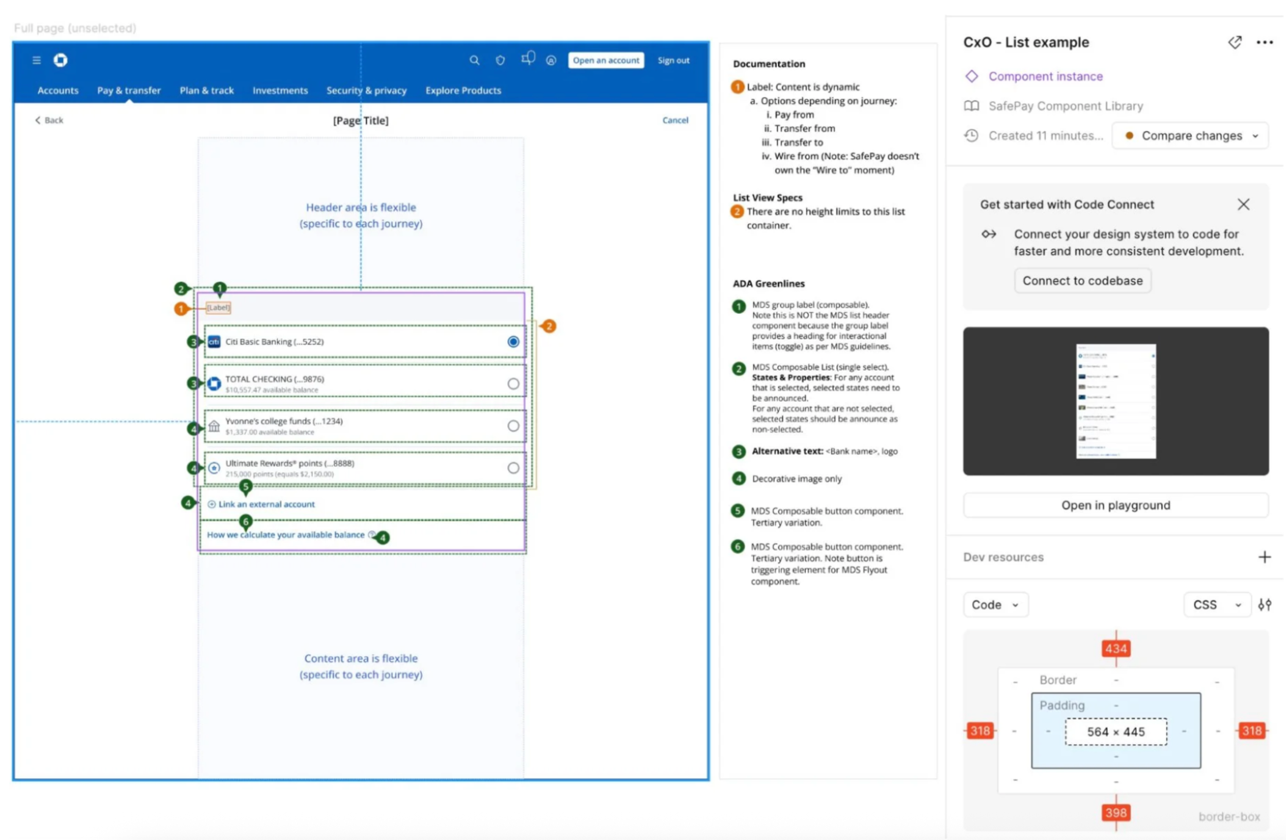
I partnered with product and engineering to translate the interaction patterns into implementation-ready requirements for a reusable payment selection platform.
I documented key payment scenarios, including happy paths, error states, and the behavior needed to maintain a consistent experience across integrating products.
SafePay progressed into implementation and an employee pilot, then shipped to customers after I left Chase.
IMPACT
Establishing a foundation for scalable payment experiences
SafePay for Web progressed from discovery and design through implementation and employee pilot, then launched to customers after my departure from Chase.
A reusable design approach
Defined dropdown and list-selection patterns to support different levels of payment complexity.
A foundation for cross-product adoption
Documented integration requirements for Pay Chase Card, Pay Auto, and My Chase Loan. Zelle and Pay in 4 were identified as planned integrations.
Designed to evolve
Established a flexible design direction intended to accommodate more complex payment capabilities while maintaining consistency across banking journeys.
Measuring success
Payment completion, account-selection errors, and adoption by product teams were identified as potential measures of success. I left Chase before customer launch and don't have verified post-launch performance data.
KEY LEARNINGS
Designing platforms means designing for differences
01
Consistency doesn't require uniformity
A shared platform should establish common principles while adapting to the needs of different payment journeys.
02
Research should shape the system
Customer behavior informed not just the interface, but the criteria for choosing the right interaction pattern.
03
Adoption is part of the design problem
A platform succeeds when product and engineering teams can integrate it without compromising their customers’ experience.