Split Tender for Chase Card Payments
We shipped a way to pay a Chase card bill with Ultimate Rewards points. Then the data showed almost nobody had enough points to use it.
The fix wasn't a better points feature. Paying with points was always going to be a partial payment, so I designed for that as the normal case instead of the failure case.
My role: Sole designer, end to end. Problem framing, four interaction concepts, allocation and error-state logic, accessibility annotation, delivery specs.
Partnered with: 1 UX researcher, 1 content designer, 1 PM, 5 engineers, plus legal/regulatory and accessibility review.
Timeline: 6 months. 2 discovery, 3 design and research, 1 delivery.
Status: Shipped to Chase Mobile.
THE PROBLEM IN NUMBERS
Two numbers that didn't fit together
Chase had just added Ultimate Rewards points as a payment method on the Pay Card flow. The business case was good: points redeemed against a statement balance cost the bank less than most other redemption paths, and customers had been asking for it.
Then I looked at how the two populations sized up.
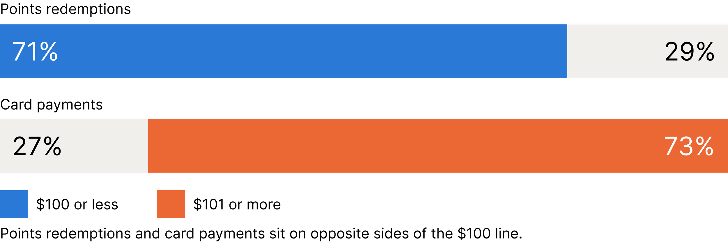
71% of points redemptions were worth $100 or less. 73% of card payments were $101 or more.
THE PROBLEM IN PRACTICE
What it felt like to hit the wall
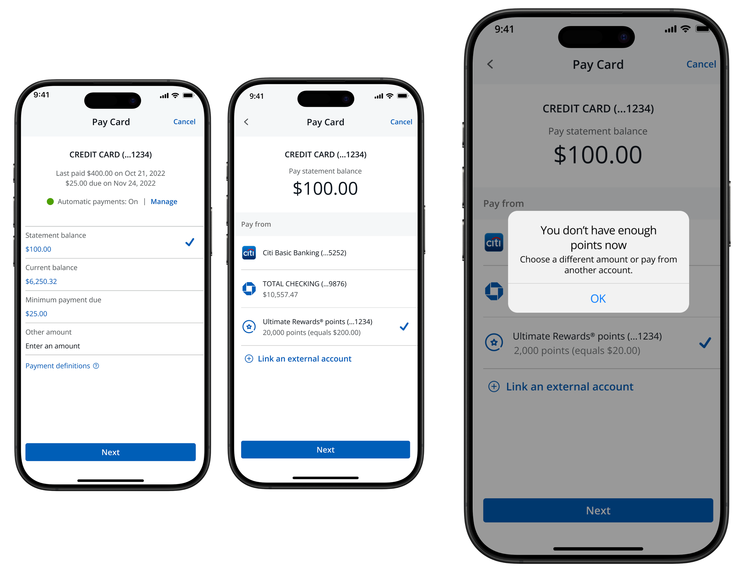
The feature worked for the narrow band of customers whose points happened to cover their bill. For everyone else it did something worse than not existing. It let them get three steps into a payment, choose points, and then hit a dead end: "You don't have enough points now."
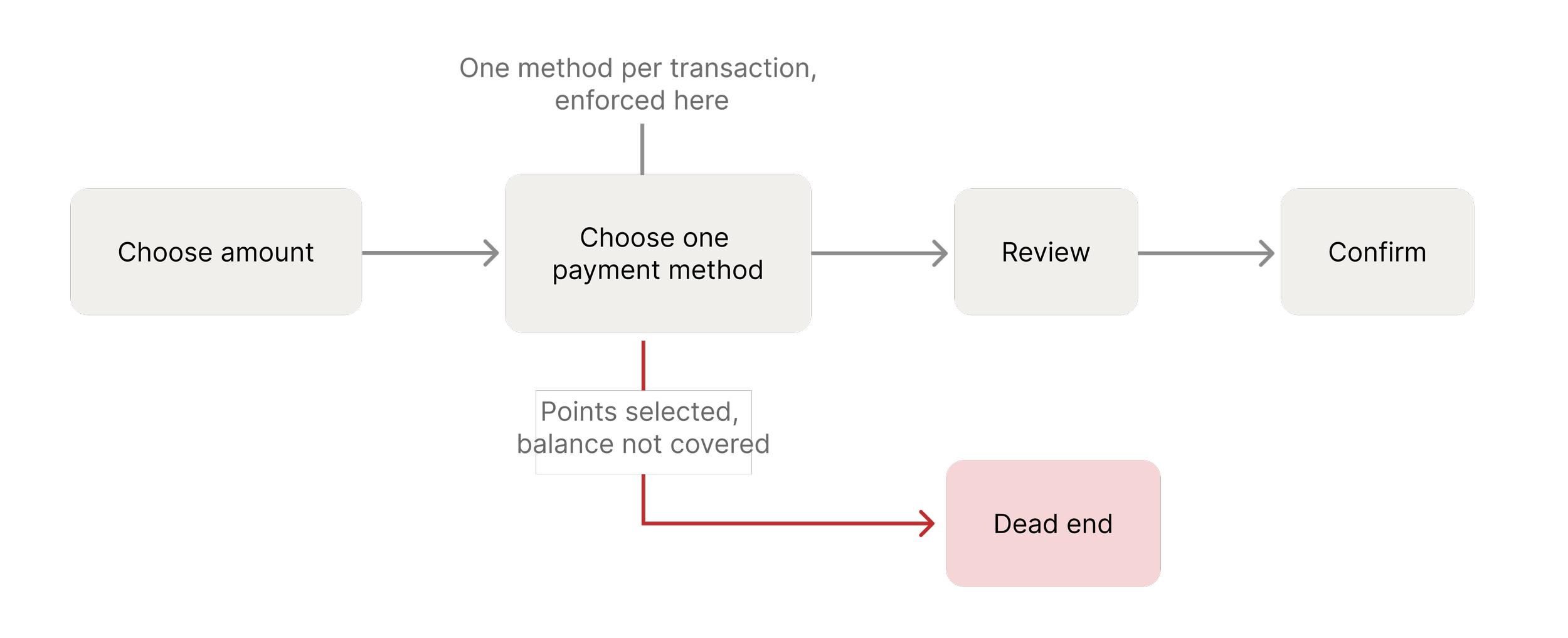
The existing flow accepted exactly one payment method per transaction. So a customer with $40 in points and a $300 bill had two options: give up on the points, or pay twice. In testing, people did both and a few invented a third, redeeming points to cash back first and then paying the bill, which took days and defeated the purpose.
Two findings from usability testing told me this was a comprehension problem as much as a mechanical one:
“It’s confusing that I can use points, but then I have to do the whole thing again to pay the rest.”
“I only realized I hadn’t finished paying after getting the late fee notice.”
A payment flow that leaves people unsure whether they've paid doesn't just frustrate them. It generates late fees, support calls, and complaints, and none of those costs sat on the team that owned the feature.
THE REFRAME
The brief I was given, and the one I argued for
The work came to me as an error-handling problem: customers hit a wall when their points fell short, so improve the wall. Better copy, a clearer path back, maybe a suggested amount.
The data said the wall was the wrong object to improve. If 71% of points balances sit under $100 and 73% of bills sit above it, then "points don't cover this payment" isn't an edge case the system should handle gracefully. It's the median case, and the system was treating the median as an exception.
So I reframed the problem for the team:
We weren't designing a better error state. We were designing a payment flow that had been single-tender by assumption rather than by decision. The assumption no longer held.
That reframe is what unlocked the budget for a flow change rather than a copy change. It also changed the success measure: not "fewer people hit the error," but "more payments complete in one session."
CONSTRAINTS
What I had to protect
I could change the payment-selection step. I could not change the steps around it — the flow was live, the surrounding screens were owned by other teams, and a full re-architecture wasn't on the table.
More importantly, most payments on this screen were not split payments and never would be. Whatever I added had to be invisible to the person paying their whole bill from checking, the way they always had.
The constraint became the design principle: the new capability could not tax the existing behavior. That one sentence decided more of the final design than any research finding did.
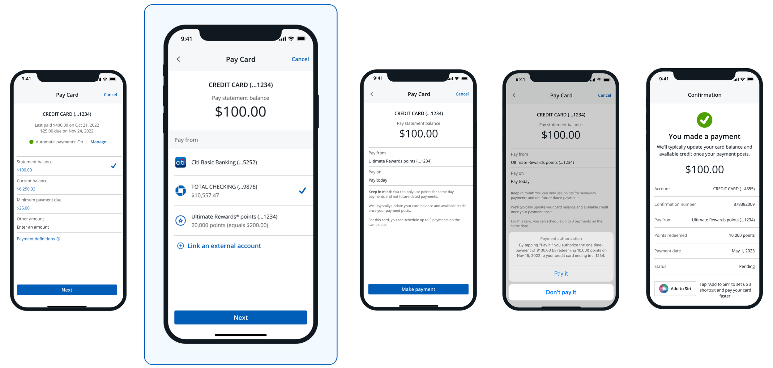
The payment-selection step was the only screen I could change. Everything on either side of it was fixed.
DESIGN EXPLORATION
Four ways to split a payment
How I evaluated four interaction models
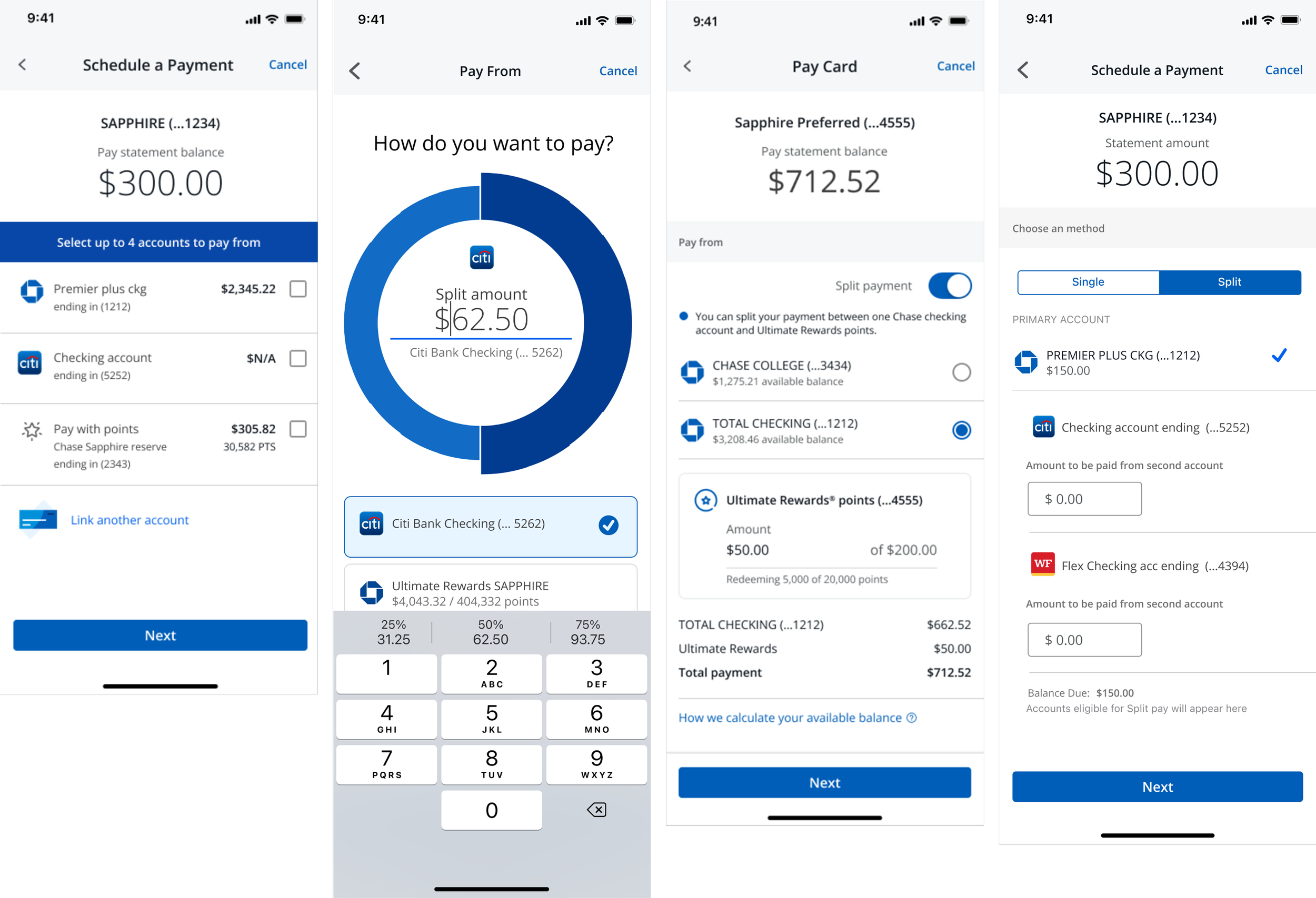
I built and tested four ways to let someone pay from two sources. They divide along one axis that mattered more than I expected: whether splitting is a mode you enter or a state you assemble.
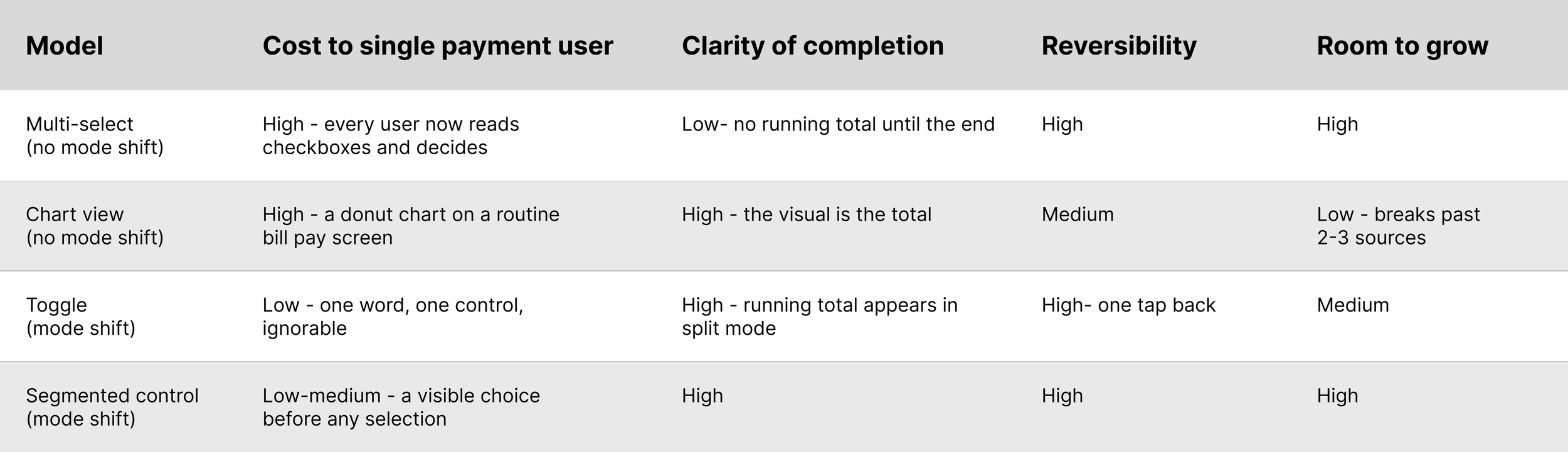
I judged them on four things:
Cost to the single-payment user. How much extra reading or deciding does someone pay who doesn't want this feature?
Clarity of completion. Can the user tell, without doing arithmetic, that the full balance is covered?
Reversibility. How easily can someone back out of a split without losing their place?
Room to grow. Does the pattern survive a third funding source, or a different card product?
ALIGNMENT
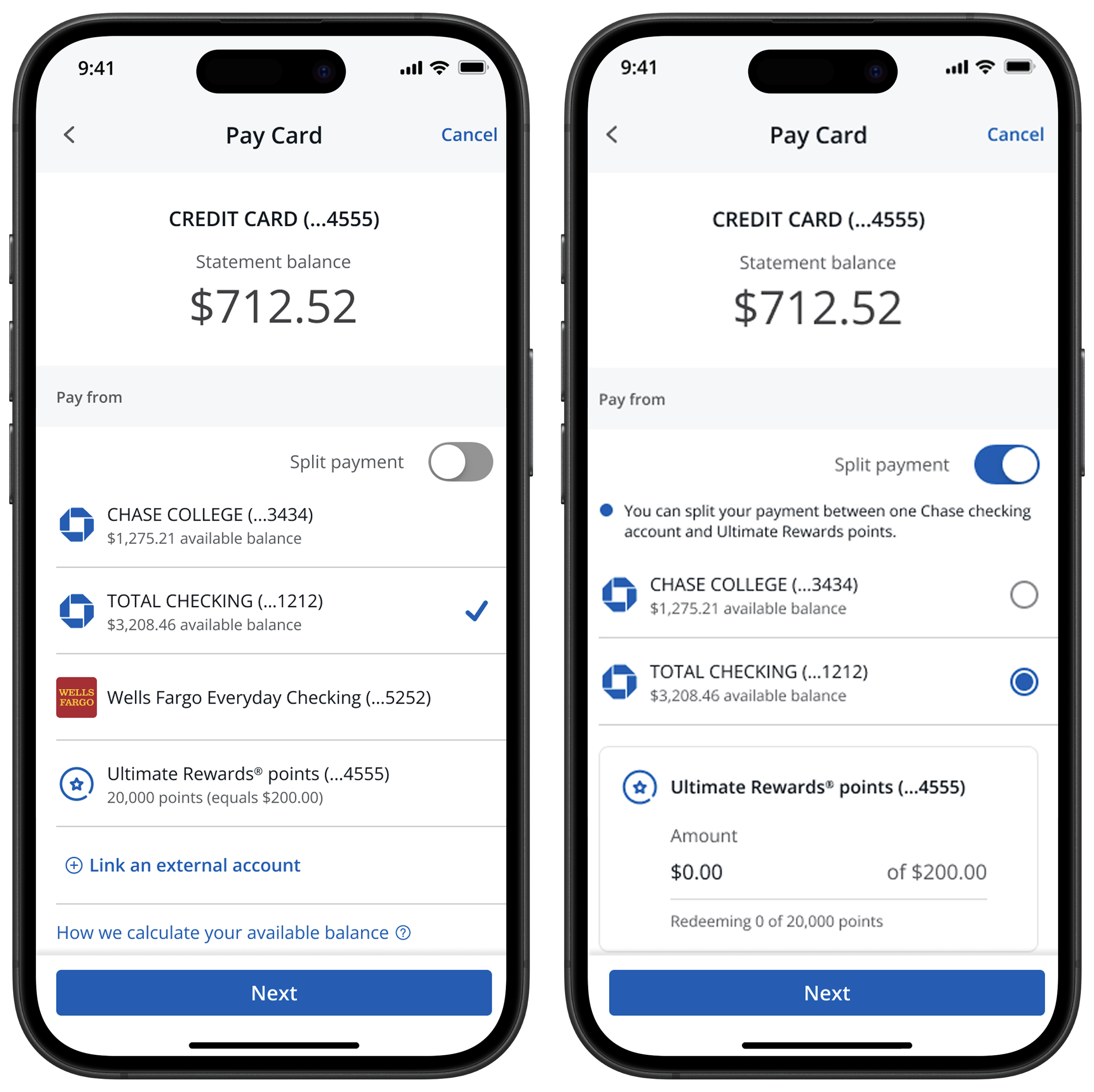
Why the toggle won
The segmented controller was the better system and the worse product, and that tension is the most interesting decision in the project.
It scales further: a third mode is a third segment, where the toggle would have to become something else entirely. But a segmented control is a question — it sits above the account list and asks every single person, including the 90-odd percent paying from one checking account, to declare an intent before they can proceed. The toggle is an offer. It's one row, it reads as off, and the person who doesn't need it never engages with it.
Given the constraint — don't tax the existing behavior — the offer beat the question. I shipped the toggle and documented the segmented controller as the migration path if a third funding source ever landed, so the next designer wouldn't have to rediscover the tradeoff.
Testing supported it for a reason I hadn't predicted. I expected the toggle to win on simplicity. It won on mental model: flipping it felt to people like entering a different kind of transaction, which made the two-source total feel like one payment rather than two. The multi-select tested worse on exactly this — people selected two accounts and still described it as "paying twice."
ALIGNMENT
The hardest part wasn’t the toggle
The hard part wasn't the toggle
The toggle took an afternoon. The four months around it went into the states where money can go wrong.
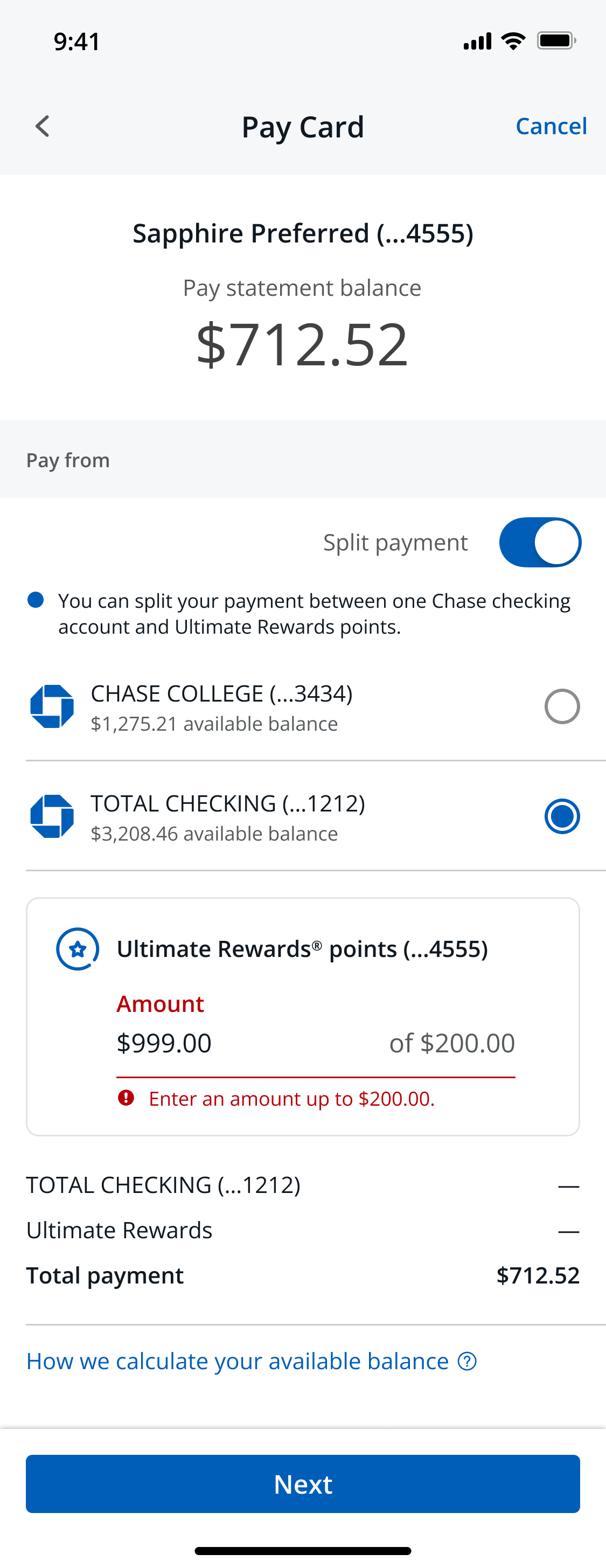
Allocating, not just selecting. Once two sources are in play, "which account" becomes "how much from which account." I defaulted the points amount to $0 and let people type up toward their available balance, with the checking account absorbing the remainder automatically. The alternative — splitting evenly, or maxing points by default — tested badly: people experienced a pre-filled points amount as the bank spending their rewards for them. Defaults in a payment flow are not neutral.
The running total is the completion signal. The line items at the bottom — checking, Ultimate Rewards, total payment — exist because of the late-fee quote. The question "am I done?" had to be answerable without arithmetic and without scrolling. Every allocation change updates it live.
Available balance isn't obvious. Points have a conversion rate, checking has holds and pending transactions, and a user who sees one number and gets charged against another loses trust permanently. I added an inline explainer for how available balance is calculated rather than burying it in a help center article.
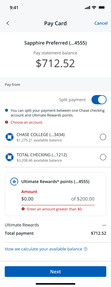
Error states, specified before happy path sign-off. Insufficient points mid-allocation. A points balance that changes between screens. An external account that fails verification after selection. A split that no longer covers the balance because the statement updated. I wrote these as logic, not as screens, so engineering had the decision rules rather than a set of mockups to interpret.
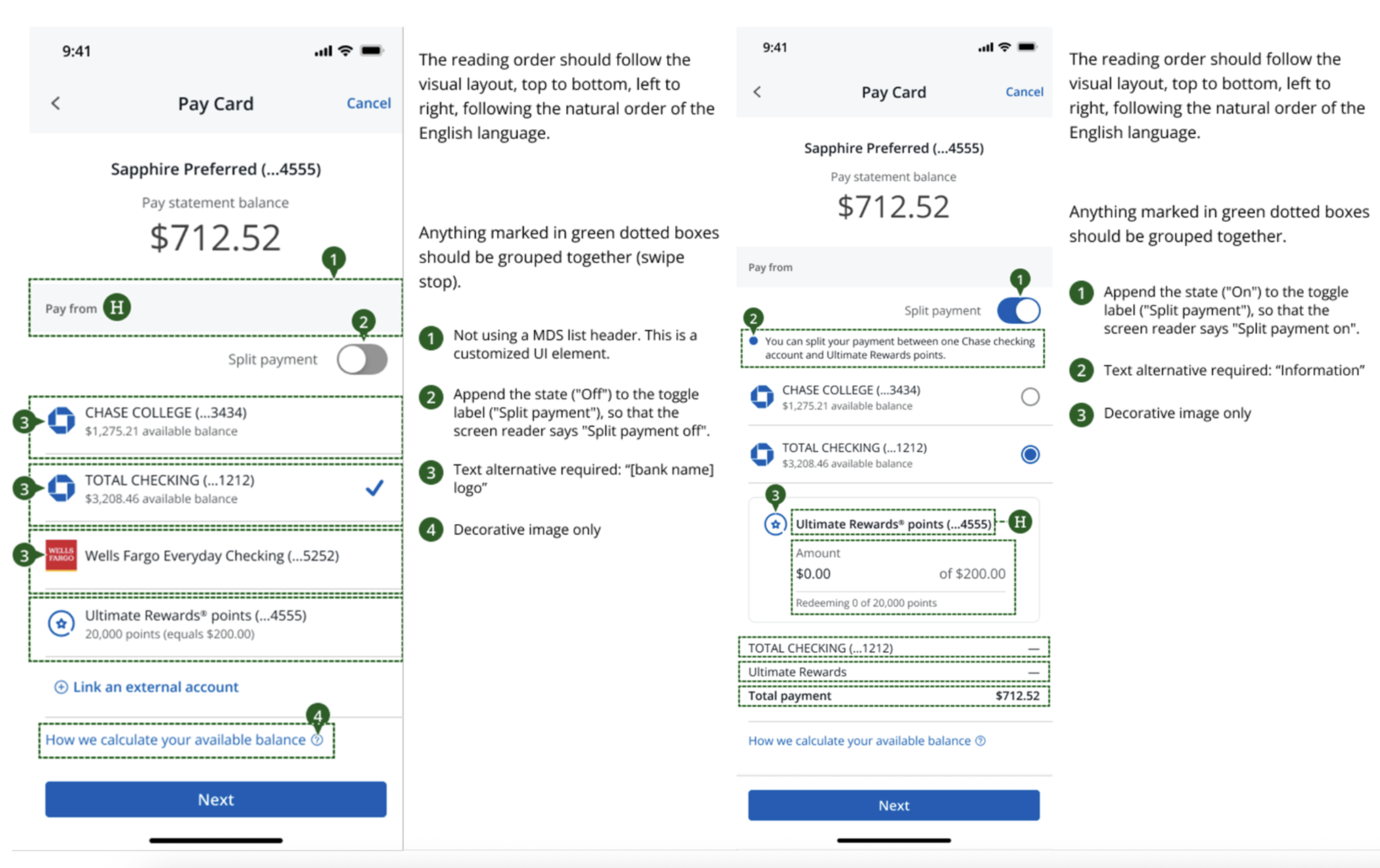
Accessibility, annotated by me. I produced the screen reader specs directly rather than handing off and hoping: toggle state appended to its label so VoiceOver announces "Split payment, off"; grouped swipe stops so the account row and its balance read as one item instead of two; text alternatives for every bank logo; the allocation block marked as a heading so it's reachable by rotor. A split-tender flow is the kind of screen where an unlabeled toggle state means someone can't tell which payment mode they're in — that's not a polish issue, it's an exclusion issue.
Compliance as a design input. Legal and regulatory review sat in the loop from the first prototype, not at the end. Points redeemed against a statement balance have disclosure requirements, and discovering those after the interaction model is locked means redesigning. Bringing them in early cost me two weeks of meetings and saved a rebuild.
OUTCOME
What shipped
Split tender shipped to Chase Mobile. It went out as a toggle on the Pay Card screen, with points-and-checking as the first supported combination and the allocation model built to take more.
Before I handed off, I specified what we'd watch, because "did this work" needed a definition that wasn't toggle taps:
Single-session completion rate for payments involving points — the real target, since the original failure was people leaving and coming back
Toggle engagement vs. completion — if people turn it on and abandon, the allocation step is too hard
Error-state frequency by type, to find out which of my edge cases were actually common
Points redemption volume against statement balances, as the business measure
No regression in single-payment completion — the guardrail for the "don't tax existing behavior" principle
I left Chase before the post-launch readout, so I can't report the numbers. What I can say is what the pre-launch evidence showed and what I asked the team to measure.
REFLECTION
What I’d do differently
In hindsight
I validated the interaction model before validating the allocation model. Testing focused on whether people understood split mode — they did, quickly. The harder question was whether people could decide how much to allocate, and I got to that late. If I ran it again I'd test the allocation step first, because it's where the real cognitive load sits and it's the part that would have changed the interaction model if it had failed.
I accepted "one Chase checking account plus points" without pushing hard enough on why. The limit came from the payments backend and I took it as given. The research was full of people describing splits across two external accounts, and I never built the case for that. It would have been the more valuable version of this feature, and I should have at least made someone say no to it in writing.