Rethinking digital wallet navigation
Designing a more intuitive, trustworthy pattern for digital payments.
ROLE
Lead UX Designer
TEAM
Research, Product, Content, and Engineering
TIMELINE
3 months
THE OPPORTUNITY
Digital wallet adoption starts with trust.
Digital wallets promised a more convenient way to pay, yet 76% of Chase credit card users had not adopted them.
For customers concerned about security, privacy, and control over their financial information, convenience alone wasn't enough.
The design challenge
How might we make digital wallet navigation feel more intuitive, transparent, and trustworthy?
My approach
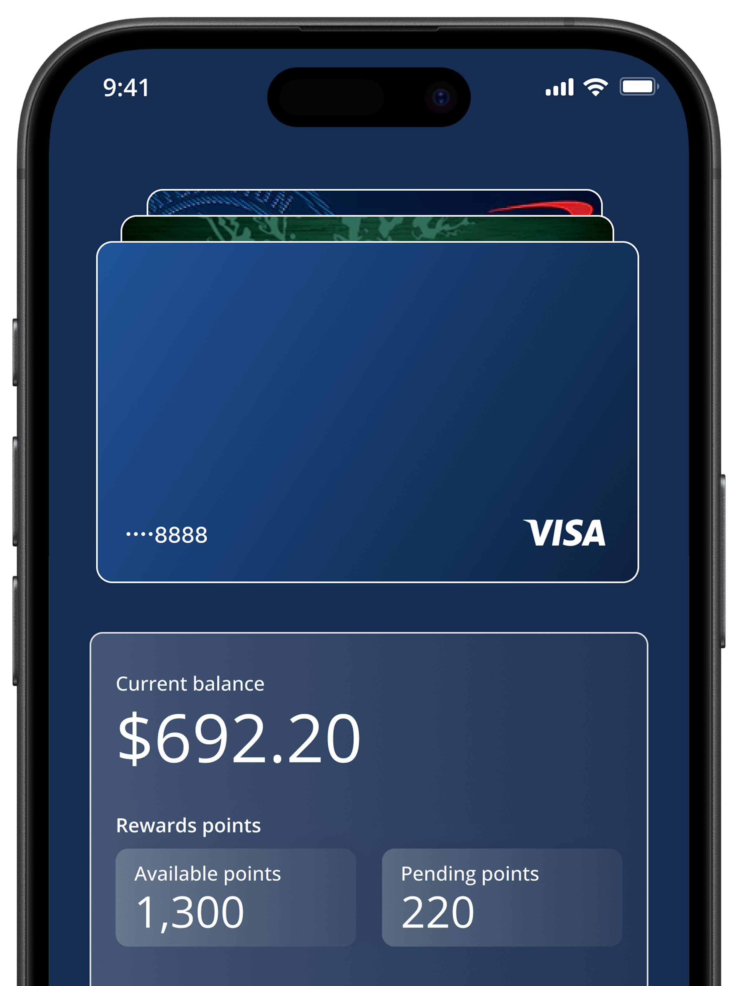
I led the exploration of a new interaction model, challenging the conventional card stack to rethink how customers navigate between payment methods.
UNDERSTANDING THE PROBLEM
The challenge wasn't just usability. It was trust.
Established wallet patterns didn't fully address the needs of customers hesitant to adopt digital payments. I examined the adoption gap, customer concerns, and research findings to identify where the experience needed to improve.
76%
NON-ADOPTION
A significant adoption gap
Internal Chase data showed that 76% of credit card users had not provisioned a card to a digital wallet. This highlighted an opportunity to make the experience more approachable.

Trust was a key concern
MaxDiff research identified security and privacy as leading concerns. Customers wanted to protect their financial information and feel in control of how they used digital payments.

The experience needed to feel intuitive
Security Stewards emerged as the highest-opportunity segment, with Simplicity Seekers representing another important audience. Both informed the need for clear navigation without unnecessary complexity.
FINDING THE OPPORTUNITY
The category had a convention. I looked for room to rethink it.
I analyzed established digital wallet experiences, including Apple Wallet, Google Wallet, and PayPal to understand how they organized cards, surfaced information, and supported navigation.
Rather than simply following established patterns, I looked for opportunities to improve how customers recognize cards, understand relevant information, and navigate between payment methods.
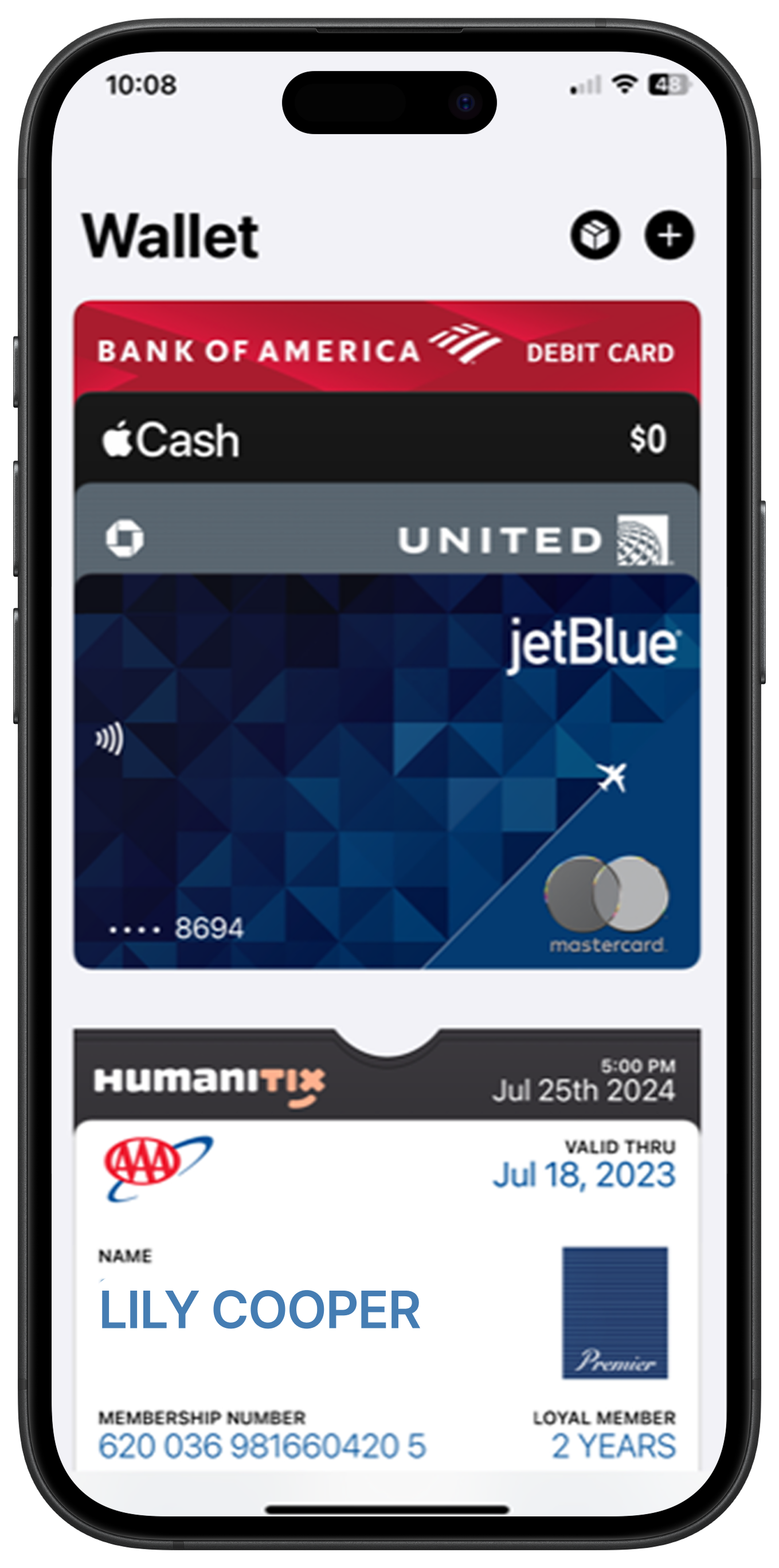
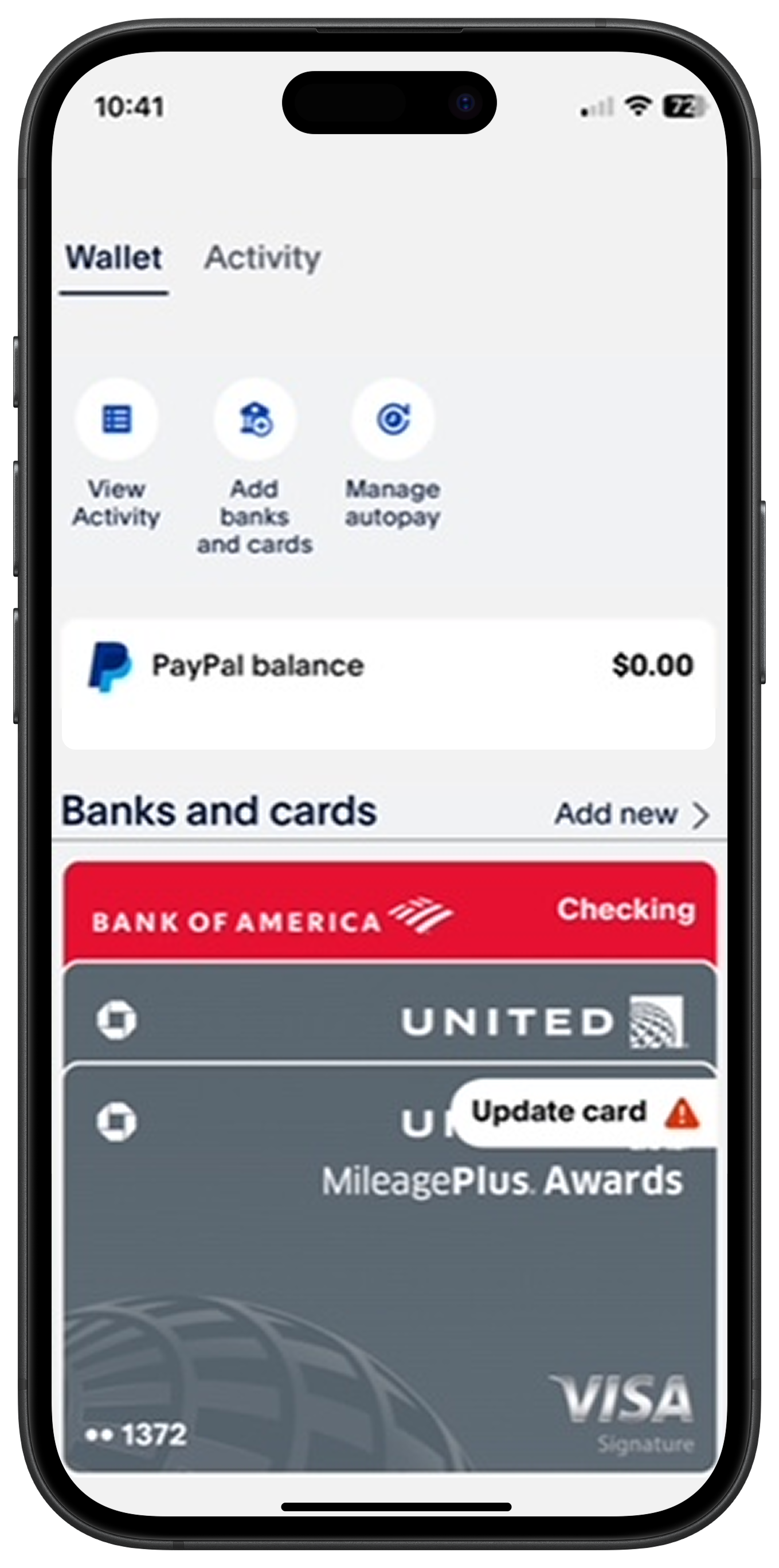
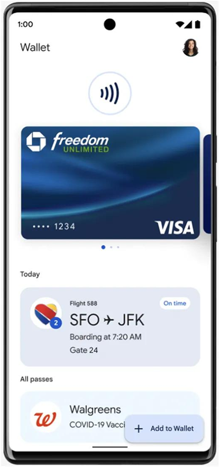
Show more than the card
Card visuals help customers recognize payment methods, but relevant account information can help them understand their options without leaving the home screen.
Make navigation visible
Customers should be able to recognize their active payment method and understand what else is available. Previewing adjacent cards could make navigation more discoverable.
Build on familiar mental models
Physical wallets offer a familiar way to organize and browse cards. Exploring similar spatial cues could make digital navigation feel more intuitive without simply copying another wallet's interface.
What if we rethought not just how cards were displayed, but how customers interacted with them?
This question became the starting point for exploring alternative interaction models beyond the conventional floating card stack.
EXPLORATION
Beyond the card stack: exploring new interaction models
The competitive analysis revealed an opportunity to move beyond the conventional card stack. But changing the visual treatment wasn't enough—we needed to rethink how customers would understand and navigate their cards.
I led concept exploration across three dimensions: how cards were organized, how account information was surfaced, and how customers moved between payment methods.
1
Carousel navigation
Could customers browse cards horizontally while keeping account information visible?
2
Floating shelf
Could a persistent floating icon allowing access to a card shelf make other payment methods easier to discover without losing access to account details?
3
Card overlay
Could an account overlay that activates when you tap on your card provide a more direct way to select a different card while preserving the broader wallet context?
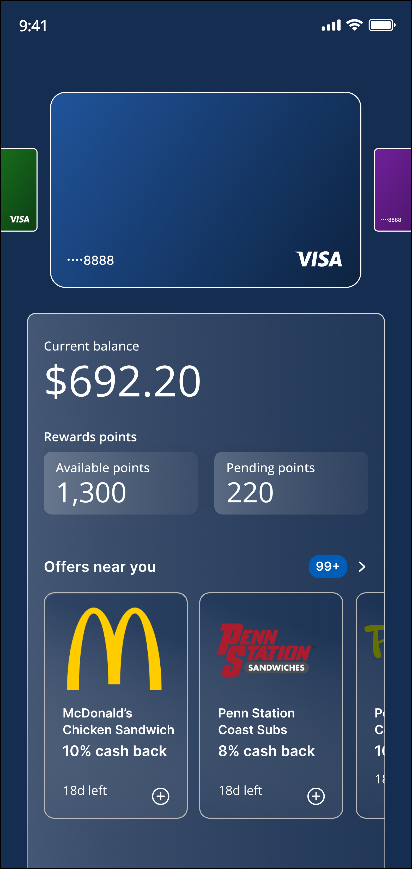
Carousel navigation
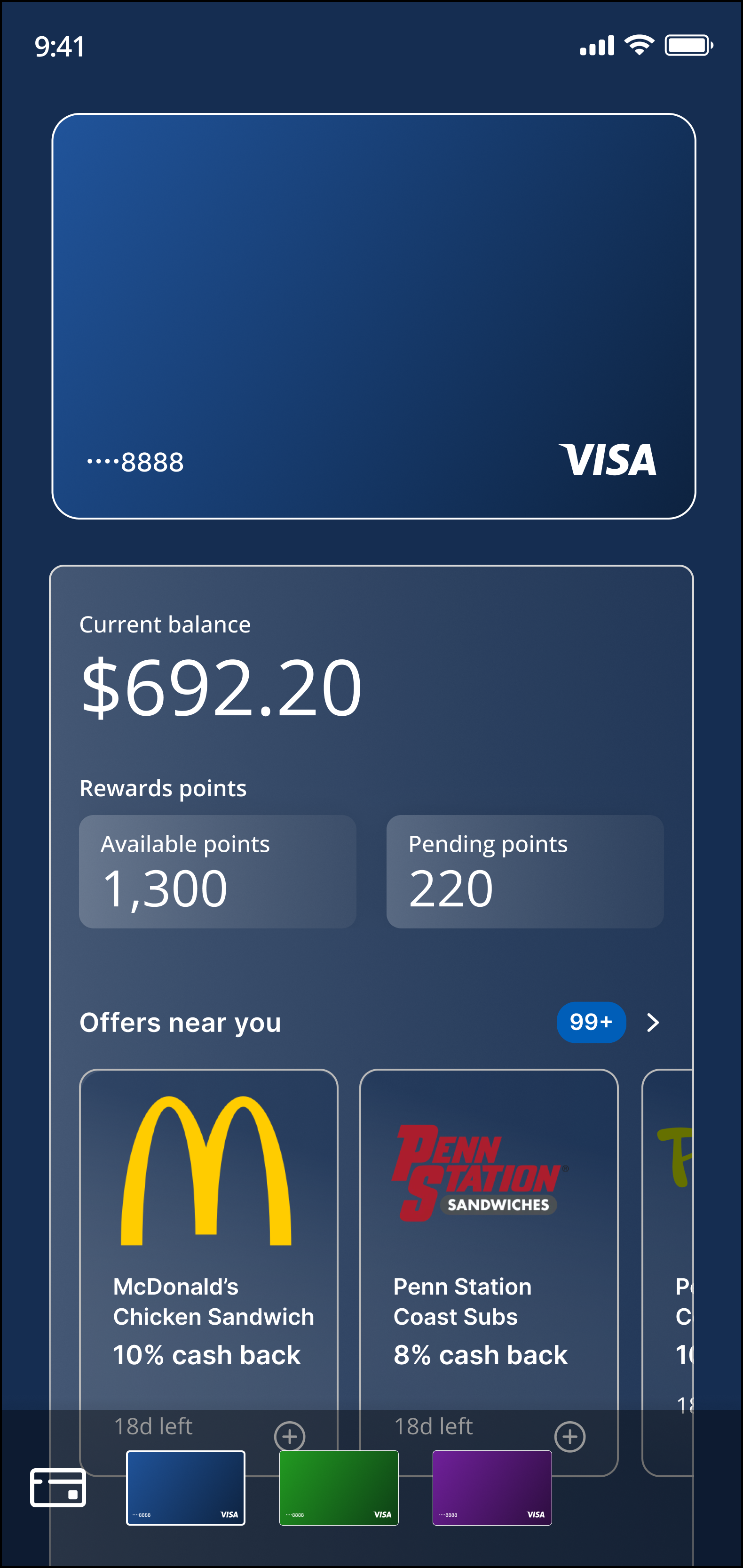
Floating shelf
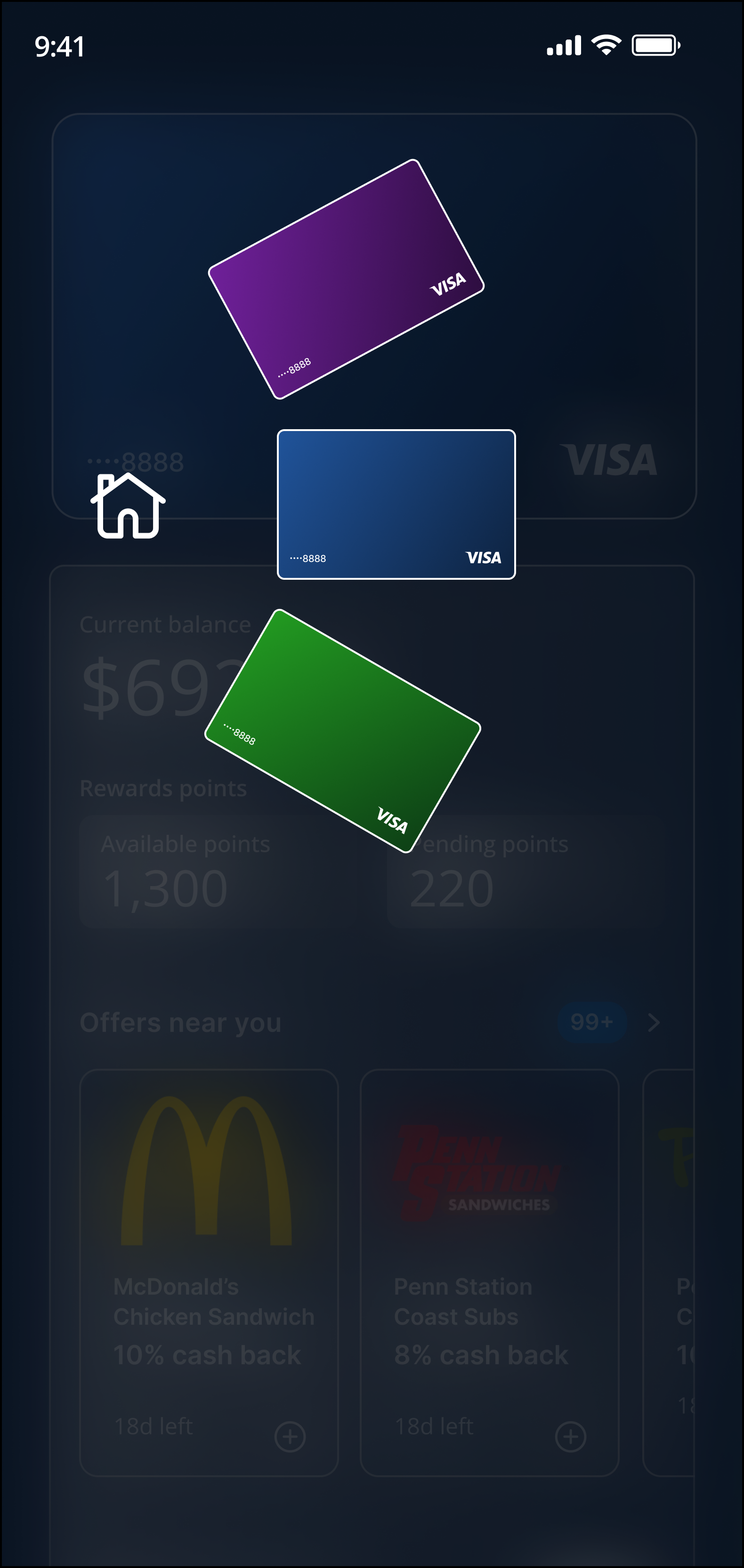
Card overlay
The central tension was familiarity versus utility. A highly visual interface could feel recognizable but hide useful information. A more functional layout could improve access to information but lose the familiarity of a traditional wallet.
From floating cards to a deck on a table
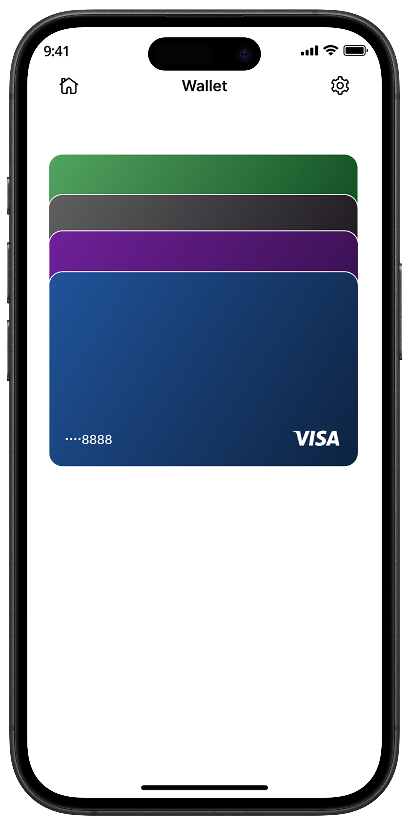
The existing card-stack paradigm treated cards as images floating in space. I introduced a different mental model: a deck of cards arranged on a surface, inspired by how people physically lay out and navigate cards.
This shifted the conversation from how the wallet looked to how customers could interact with it.
Made navigation feel grounded
Used a recognizable physical-world reference as an alternative to the floating card stack.
Opened up new interaction possibilities
Explored spatial relationships and new ways to move between payment methods.
Created room for clearer information hierarchy
Investigated how partial cards and supporting account details could coexist on the home screen.
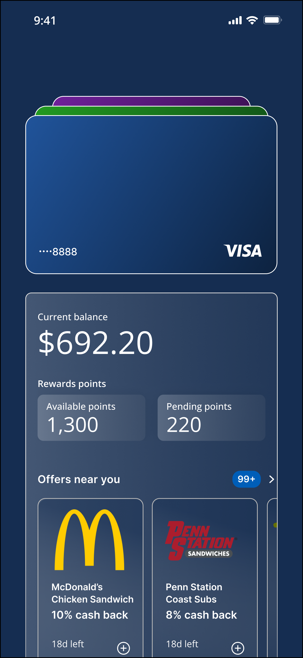
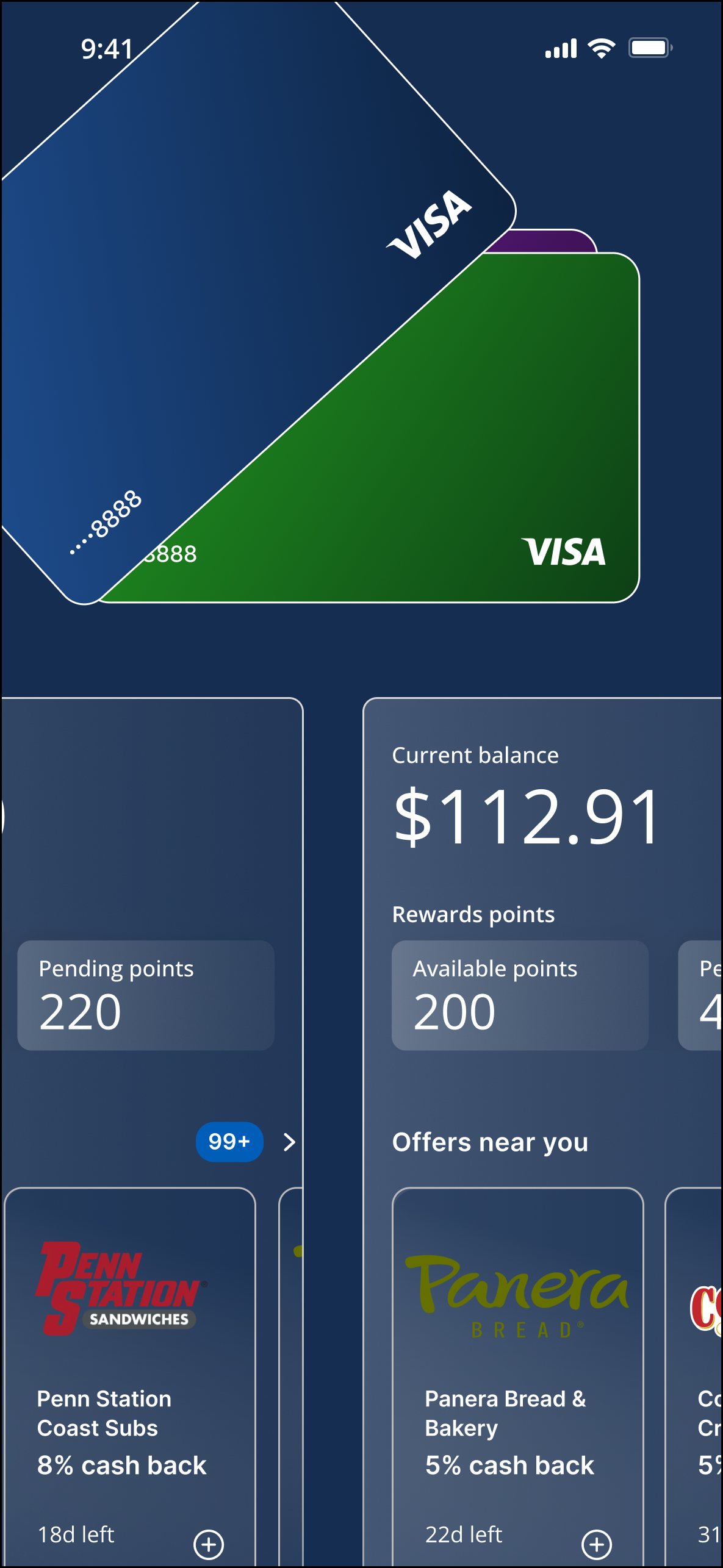
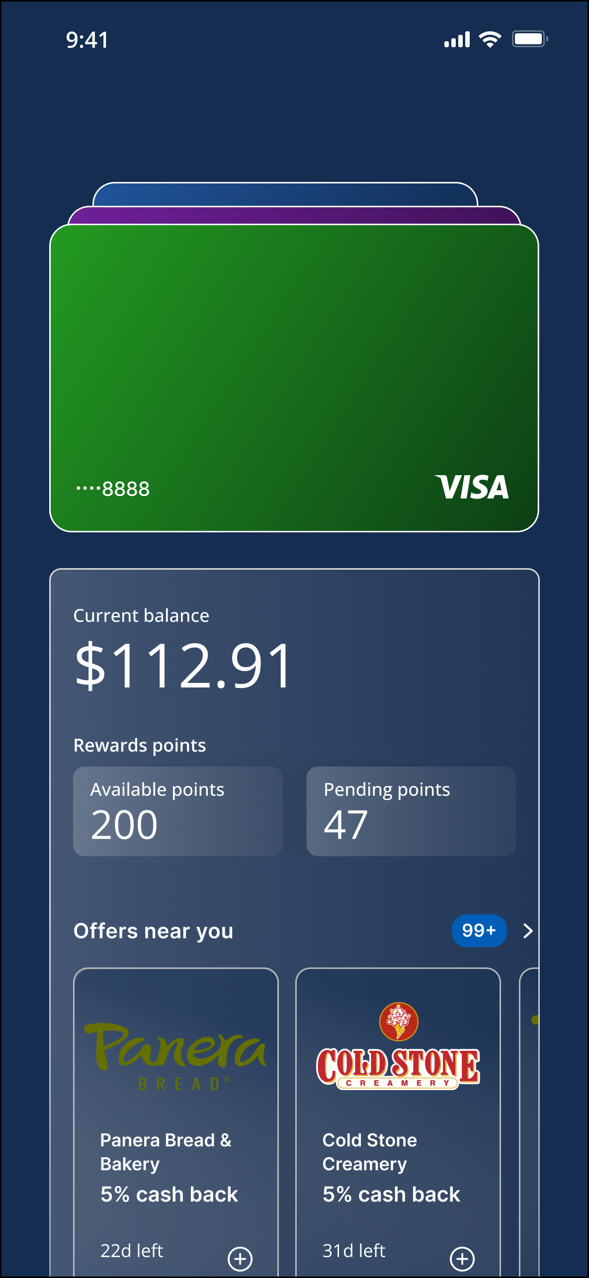
Exploring how a deck-like arrangement could support navigation between accounts while keeping relevant information visible.
By challenging an established interaction convention, I reframed the discussion around how customers understand and navigate their payment methods—not simply how cards appear on screen.
DESIGN PRINCIPLES
Designing for spatial understanding
The deck-of-cards concept reframed the wallet home screen around how people understand, organize, and navigate physical cards.
Three principles guided the design exploration: make available options visible, build on familiar behavior, and prioritize clarity.

Make what’s next visible
Design decision:c Use partially visible adjacent cards to signal that other payment methods are available.
Why it matters: Help customers anticipate what's next without searching through menus or remembering where options live.
Build on familiar behavior
Design decision: Use the physical experience of looking through a wallet as a reference for digital navigation.
Why it matters: Give customers a recognizable mental model, particularly those less comfortable with digital wallets.

Prioritize clarity at a glance
Design decision: Explore how card positioning, visual hierarchy, and supporting account information work together.
Why it matters: Help customers recognize their cards and understand available options without unnecessary navigation.
Design implications
The exploration highlighted four considerations for the next stage of design:
Spatial memory: Help customers understand where payment methods sit in relation to one another.
Familiarity: Balance a new interaction model with recognizable physical-world behavior.
Error prevention: Make the default state and available payment options clear.
Scannability: Keep essential account information visible without overwhelming the home screen.
Together, these considerations connected the deck-of-cards concept to the practical needs of a financial product: clarity, confidence, and control.
OUTCOMES & REFLECTION
Establishing a new direction for wallet navigation
The project moved the conversation beyond familiar card displays toward a more deliberate interaction model grounded in spatial understanding, clarity, and user control.
90% clarity rating
Feedback from the employee pilot indicated a 90% clarity rating for the proposed experience.
3+ wallet flows
The interaction model was used as a reference for three or more wallet flows, extending the concept beyond the home screen.
A shared design direction
Established a clearer rationale for evaluating navigation patterns, connecting customer needs to interaction design decisions and giving the team a foundation for continued exploration.
Reflection
The most valuable part of this project was challenging an established convention rather than assuming it was the right solution. I reframed the problem from how cards should look to how customers could understand their options and navigate between them.
Introducing the deck-of-cards concept gave the team a different way to think about the relationship between familiarity, information hierarchy, and interaction. It also reinforced an important part of my approach to product design: use customer needs to challenge assumptions, make the rationale behind design decisions explicit, and give cross-functional partners a clear direction to explore.